Almost all programmers have a color scheme or theme in their terminal and their code editor. Some people actually turns syntax highlighting off, but I will never understand that. To me - code is something that lives on a black or dark background and has syntax colors. I have only ever used a white background color scheme back when I was using Eclipse 8 years ago. And probably because I couldn't figure out how to set another color scheme than the one that comes with Eclipse.
Lately I have been really bothered by reflections in my glossy screen om my MBP and my Apple Cinema Display (I know - first world problem). In the afternoon all I could really see was me - like I was looking in a mirror. While that is very enjoyable it is not the way to get work done, so I set out to find a color scheme that would make it easier to see what I am working on and not myself so much. In that process I found out that I am super sensitive to changes in my editor work setup. Change the colors a little and I have a hard time reading through code fast. It is weird and a little bit stupid that it is so, but I can't help it. It takes me about 2 weeks to get reasonably comfortable with changes to a color scheme.
This blog post is really just a listing and some screen shots of the color schemes I like. And let me tell you right now: there is no dark background color scheme that solves the glare problem - I tried tons of them and none of them are magic. Moving your chair or source of light solves some of the glare problems, but if Apple would just go back to offering a non-glare version it would be a lot easier.
The ones I like
Desert theme
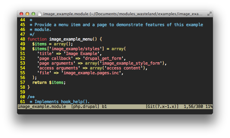
I really like the "Desert" color scheme that comes with Vim as one of the default color schemes.
 The only thing I find a little annoying is the hysterically yellow line numbers. I have put this line in my .gvimrc to tone down line numbers after the color scheme is applied:
hi LineNr guifg=grey50 guibg=grey20
That is better:
 I haven't found a desert color scheme for PHPStorm yet. I also don't really like to use it in the terminal, so I guess the desert theme is a Vim thing for me.
Tomorrow
In both the terminal and PHPStorm I use the Tomorrow theme. It comes with support for a ton of different applications and is really well thought out. I started using this one because it has a white background version too. So much like the popular Solarized theme it can use the same colors on light and dark background. In the terminal I mainly use Tomorrow Night Eighties and in PHPStorm I switch between Tomorrow Night Eighties and just plain Tomorrow.
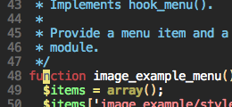
Here is the dark version (Tomorrow Night Eighties).
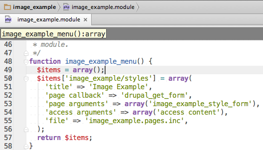
 And here is the light version (Tomorrow).

I still mostly use the dark version, but when glare becomes too much I can pretty comfortably switch to the light version and still get stuff done. It is crazy how sensitive I am to having the colors be recognizable.
Darcula
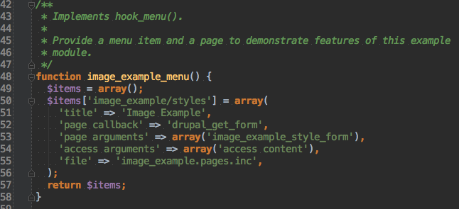
This is the color scheme that comes with the look and feel for PHPStorm called Darcula. I think it is really good looking and I can use it - but only if there is not too much light. It is a little on the low contrast side.

The one I don't like so much
Solarized
I realize that all code snippets on my blog use solarized. It is mainly because I haven't taken the time to change it. It really is not as simple as you would think in Octopress. Ironically - on the documentation site for Octopress solarized is not used. I haven't figured out what theme it using. Maybe it is solarized without the yellow background and just plain white.
Anyway. No reason the hate on solarized. So many people use it and love it. I just happen to think that the dark version has almost zero contrast and the yellow version makes me want to pee.